
The landing page exists for one reason and one reason only: to convert a user into the sales funnel. That may be from a call, a contact form, a white paper download, a video watched, or any number of things that will engage a prospective client.
To that end, often times landing pages are used in conjunction with an ad campaign. The page must be part of a user experience that is consistent from the initial search query to the final conversion. Let’s say a user is looking for digital marketing services in a Google Search campaign, their path would look like this:
Once the user is on the landing page they encounter the following elements:
The messaging on a landing page should be clear and concise. The message should take the user by the hand and lead them directly into the desired action.
Less is more! Landing pages should be clean and clear, with the relevant messaging and associated imagery, and nothing else that may distract the user from taking the next step.
The best landing pages are the ones that compel a user to do one (1) very specific thing. Whether you’re looking for a direct conversion, or trying to secure contact information, the CTA should be easy to understand and easy to execute.
While we always look for clean, crisp landing pages with clear CTA’s, there is other information that should be present. Social proof, like logos of other clients, testimonials from past customers, third party ratings, and even a list of benefits can be added.
Landing pages should focus on the benefits of a product or service, not the features. Find creative ways to show clients how the features will translate into a benefit, instead of focusing on the feature itself. After all, would you rather a service “use advanced audience targeting and bid management” or “help your business grow faster?”
Time for a reality check: nobody cares about you or your business. The do care about how you might help them become more successful, or benefit them in some way. Always focus your text and messaging on your users, not on yourself.
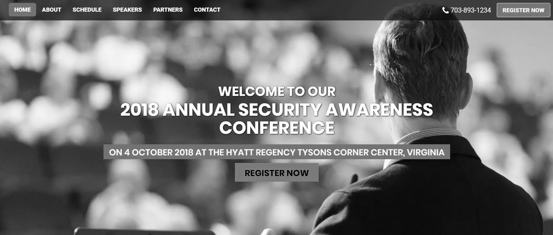
In this example, our client needed to drive registrations for an annual security conference. In the past, registrations had been captured manually and by invitation. The process was anything but streamlined. Our landing page allowed them to promote the Conference across social channels and handle all registrations online without any human interaction. The page has all the pieces of a successful landing page. Indeed, this year’s show reached capacity in record time!

Take a guess at what the primary Call to Action is?
As part of our digital marketing services, you will hear us talking about landing pages quite a bit. In order to make the most of your advertising dollars and help grow your business, this part of your web ecosystem is a must.
Contact us for a consultation for today.
Only 1 in 10 marketers feel their lead generation campaigns are effective. Read our FREE guide to learn how you can get more leads. This guide exposes the top 30 techniques to increase leads and revenue. A successful lead generation engine is what keeps the funnel full of sales prospects.