
Almost all online marketing drives people back to your website
Conversion Pipeline designs websites to improve user experience and capture leads. After all, what good is a beautiful website if it doesn’t convert visitors into prospects, or complete transactions?
During a website design engagement, our team of expert web designers help you through the process of conceiving, designing and developing a website that matches your vision and business goals.
The Website Design Process
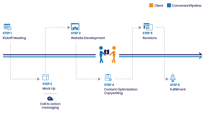 The website design process begins with a deep dive into your business. We need to fully understand how you take a qualified prospect and turn them into a customer. Additionally, we move through an extensive fact finding process so that we grasp all of the nuances to your particular company. We need this detail to create user paths and experiences that will help guide website visitors to becoming new customers.
Your website design is completed using a revision process that allows you make changes to the design until you’re satisfied. With your input, and our team of expert designers and marketers, the finished product will be a tremendous business asset.
The trouble with website templates or website “builders” is that using a on-size-fits-all approach never captures your unique business processes. A template can never match a site designed specifically for your business.
 After your website design is approved, our team of developers and hosting specialists will launch your site and provide all the Quality Assurance (QA) needed to ensure a smooth transition to your new home on the web.
Responsive and Mobile Friendly Website Design
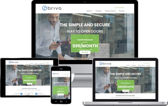
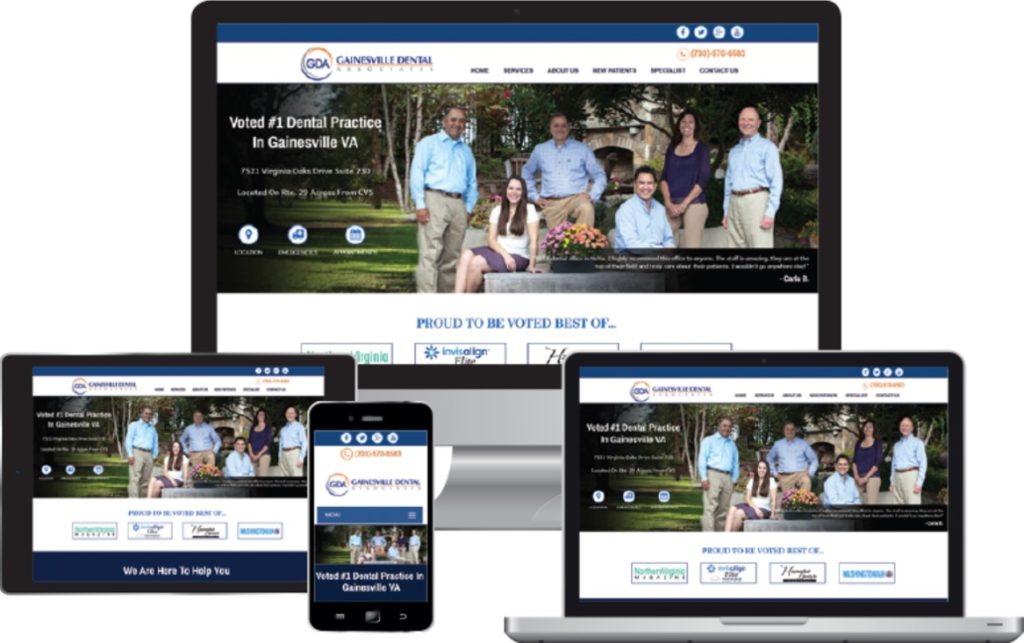
Websites must have fully responsive designs in order to meet consumer demand. With more and more users visiting websites from devices other than desktop computers, your site must be able to accommodate all kinds of traffic, from desktops, laptops, tablets and phones.
To do this, we employ “responsive” website design techniques. This allows your website to display differently depending on the type of device that is viewing the site.
Google’s Webmaster Guidelines say specifically:
 “Users now browse websites from a mobile site as often (or more often) from a mobile device as from a desktop computer. You should design your website to be viewed by mobile devices.”
Don’t fight the trend!
During your website design process, we evaluate the design for tablets and mobile devices and make all the styling adjustments needed to make your site function in all screen resolutions in a way that will maximize its effectiveness. Contact us for a consultation for today.