
We Sent Our In-House Designer To The Charlottesville Design Marathon
Here at Conversion Pipeline, we’re all about learning and personal growth, so we sent our in-house designer, Brittny to the Charlottesville Design Marathon. There, Brittny was able to learn from her colleagues and lend a helping hand at their design marathon benefiting Cultivate Charlottesville.
The Design Marathon
At the design marathon, Brittny volunteered her expertise to help a group of non-profit organizations – City Schoolyard Garden, Urban Agriculture Collective of Charlottesville, and Charlottesville Food Justice Network come together to form a parent brand, “Cultivate Charlottesville”.
About Cultivate Charlottesville
Cultivate Charlottesville (CC) will bring together three organizations to help build food equity in the local community and help engage local youth in urban farming, discover leadership skills and encourage healthy living styles.
It is with the integration of these programs that Cultivate Charlottesville can:
- Promote youth garden education, healthy living skills and leadership development
- Lead the community food production and distribution for food insecure families
- Partner across organizations to better mobilize
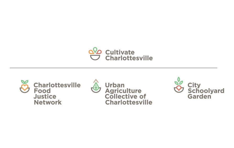
The 3 organizations that make up Cultivate Charlottesville:
City Schoolyard Garden (CSG) is in its 10th year of hosting gardens and garden programming at Charlottesville City Schools to provide hands-on, experiential garden programming for over 4,000 youth and their families. CSG currently manages eight organic schoolyard gardens and engages urban youth from pre-K through 12th grade.
Charlottesville Food Justice Network (CFJN), a collaborative effort among over 30 organizations, is working in unique and complementary ways to build health and food security. They explore ways in which local food systems create opportunities and barriers to accessible, healthy nutritious food; amplify an understanding of practices that contribute to food inequity; mobilize resources for combined impact across aligned organizations; and implement strategies and activities to transform inequities in the food system.
Urban Agriculture Collective of Charlottesville (UACC) is a grassroots organization that has connected people across social boundaries through urban farming and community food markets for over 20 years. UACC works with residents in public and subsidized housing to grow and share fresh produce with their community.
The Design Process
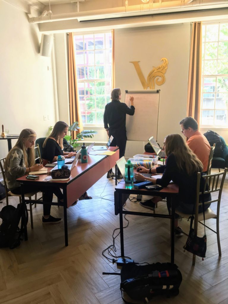
At the design marathon, a large group of designers were divided into smaller teams to come up with a brand identity and supporting elements that represented Cultivate Charlottesville as well as the three child brands; CSG, CFJN, and UACC. The catch – each team only had 8 hours to work.
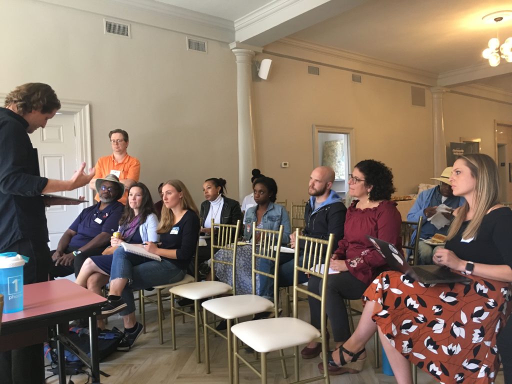
After the teams were established, representatives from each of the three organizations spoke to the teams about their design goals and provided background information on each of their respective organizations. Then, the teams broke off to get started.
Brittny’s team was the collaborative effort of 5 designers. After quick introductions, they discussed the design brief that they were given and concluded that they needed to create a logo system that would work collectively for the 4 brands; CC, CSG, CFJN, and UACC. They did not want to solely think about the Cultivate Charlottesville logo, but about a system that worked interchangeably across the four organizations that would also establish a hierarchy.
The first concept the team came up with was a recognizable container that could be filled with textures, colors and images. With that in mind, the fills used with the container could successfully be changed based on the situation. This would allow for more creativity while still establishing a memorable icon.
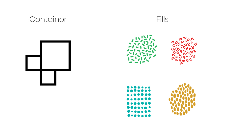
The system consisted of interchangeable boxes that resembled raised planter boxes and the varying acronyms of each organization. With the system logo in place, the raised planter box could be recognized across all 4 organizations and be versatile with usage.
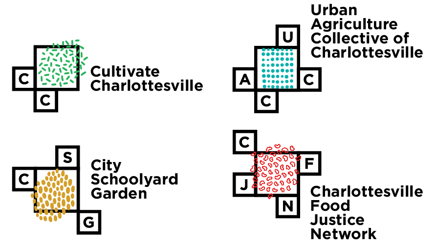
After showing the first concept to the client, they seemed receptive to the idea of a logo system opposed to each organization having their own separate logo. However, they still wanted to be able to differentiate each organization better.
With the feedback given, the team got back to work on a second concept. For the second concept, the team loosely stuck to the “logo system”, but by repeating one symbol throughout four separate logo icons.
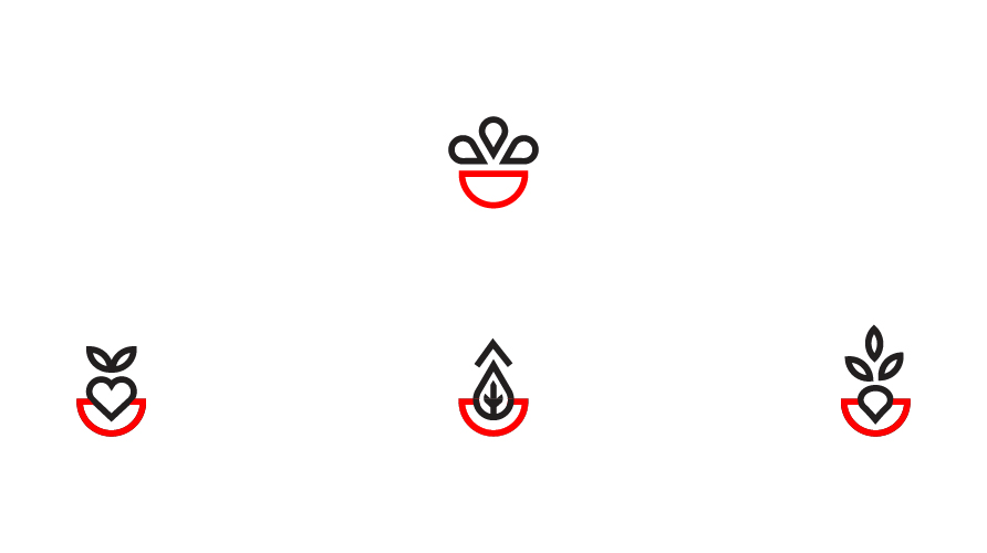
Each logo depicted a bowl being filled by different items.
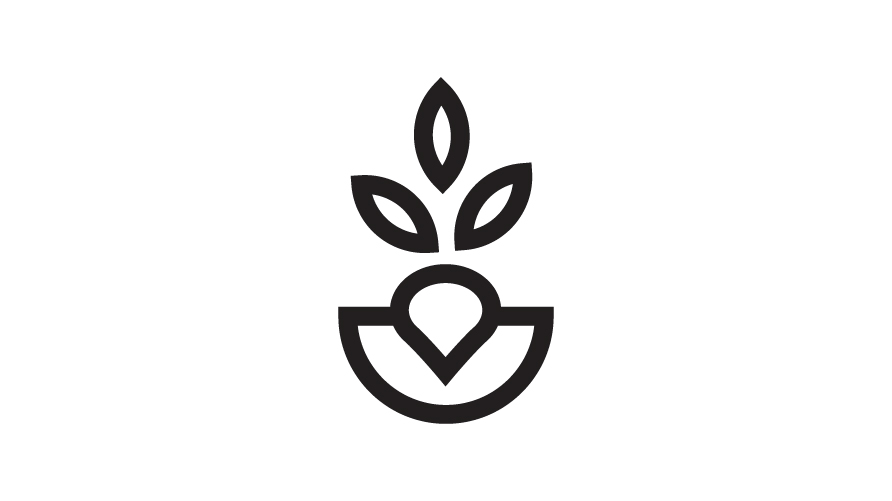
Charlottesville Food Justice Network (CFJN) depicted a bowl filled with a heart and two leaves above it. This was to represent CFJN’s conscious effort to educate locals on healthy diets and facilitating access to nutritious food.
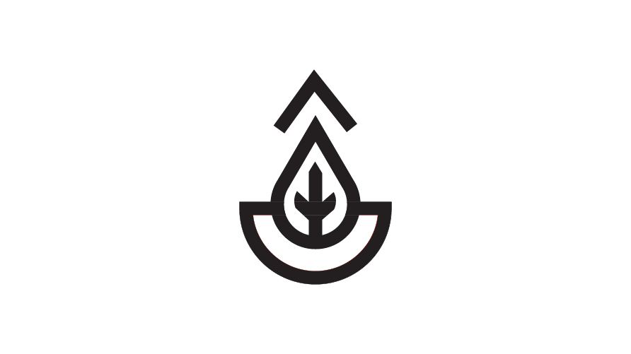
Urban Agriculture Collective of Charlottesville (UACC) depicted a bowl filled with a leaf, water droplet and roof. This icon represented UACC’s urban farming and community food market contributions.
City Schoolyard Garden (CSG) depicted a bowl filled with a radish. The icon was representative of the garden hosting by CSG for local families.
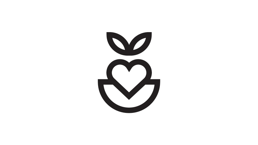
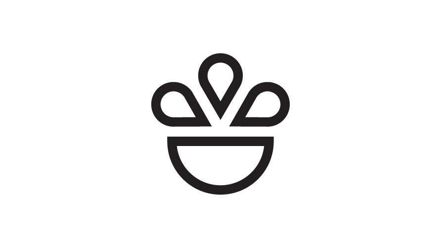
Cultivate Charlottesville (CC) depicted a bowl filled with 3 teardrop shapes. The icon represented each of the 3 child organizations, while the bowl represented CC across all the organizations. This icon was created to symbolize the unity of the organizations.
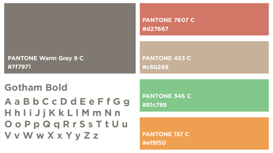
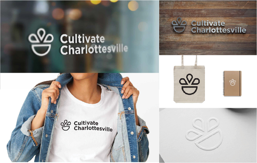
After designing the icons, the team worked on the color palette and typography. The typography the team chose created a fun, warm and inviting color palette to be integrated across the 4 organizations. The accompanying typography was a bold, san serif that could be legible at large and small sizes, textured backgrounds, and varying color backgrounds.
After choosing all supporting elements, the team combined the icons, typography and colors to form a cohesive set of logos for all 4 organizations
Once the logos were established, the team created mock ups to show how the logos would work in various applications.
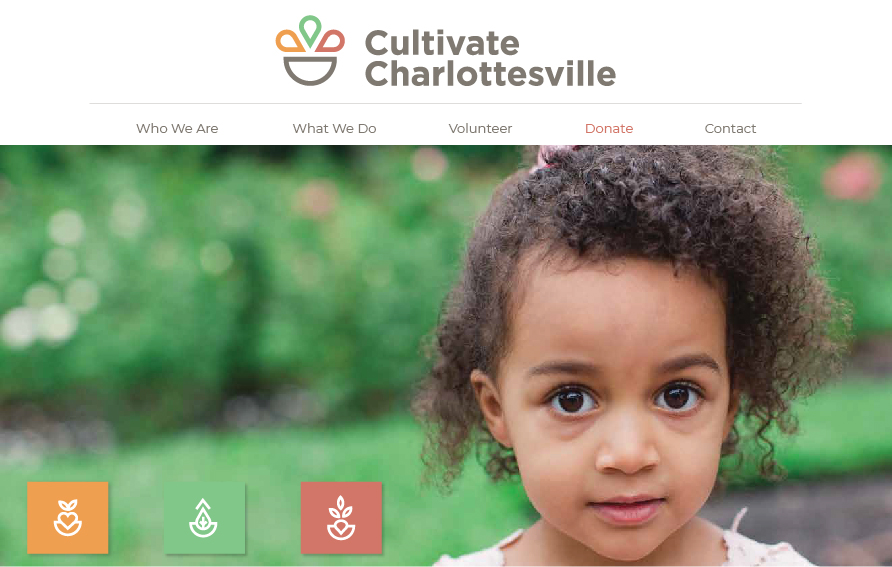
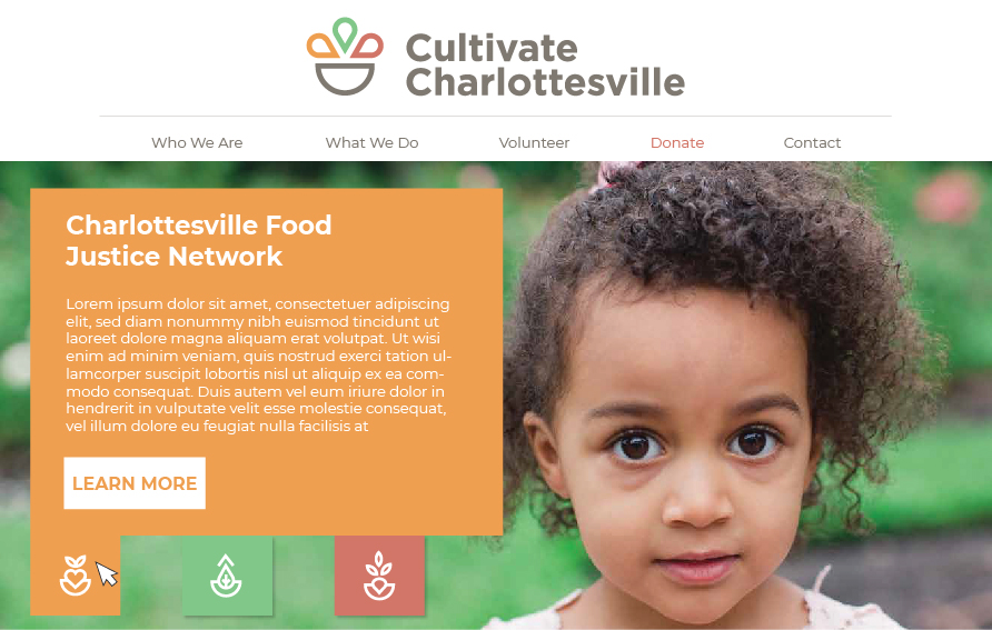
Brittny was also tasked with creating the Cultivate Charlottesville website concept to be shown to the clients. She was asked to focus mainly on the above the fold area. She chose a relatable hero photo that would also leave space available on the left-hand side for call to action buttons. Each of the buttons displayed a logo on it from each of the child companies. The color of each button was chosen based on a prominent color in each of the logos. On hover, each of the buttons would display a pop up with text about the selected organization and show a learn more link that would direct the user to the organization’s website. Finally, the main navigation area was kept clean and minimal with the donate button a separate color from the rest of the navigation to draw a user’s attention.
When the team finished all branding elements possible with the time given, the logos and supporting elements were presented to the clients for final review. Ultimately, the team’s logos were not chosen, but the client was receptive to the website mock up, typography, and supporting colors.
In tandem with a rigorous day of designing, Brittny was able to network with fellow design colleagues, learn about new brain storming methods, mock up techniques, team building, and give back to the community.
- Google Merchant Images In Local Business Ads - July 10, 2023
- Is Your Smart Phone Listening to You? - January 30, 2023
- How To Sell Your Digital Marketing Agency - January 11, 2023